
∘ Biolastics
Biolastics, a green-tech company focused on recycling plastic and promoting eco-friendly practices, partnered with Virtual Take to bring their brand vision to life — from naming to identity development.
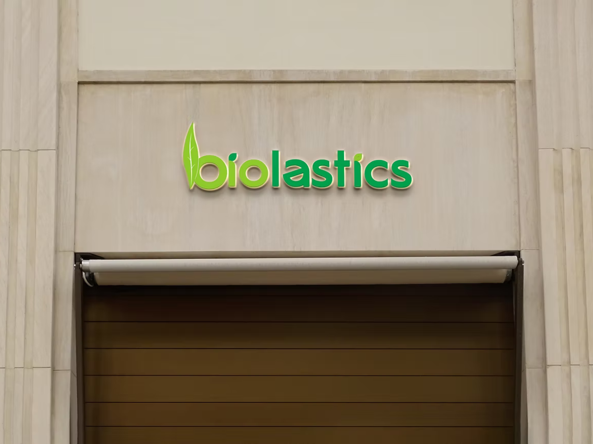
We started with the name Biolastics — a fusion of “Bio” (natural, sustainable) and “Plastics” — capturing the brand’s core mission of transforming plastic responsibly. The name immediately resonated with their values and offered strong recall and relatability in a rapidly growing sustainability market.
The logo design was crafted with intention and symbolism. We used two shades of green:
• A light green for “Bio” to reflect growth, nature, and freshness
• A deep green for “Lastics” to represent stability and the strength of recyclable material
Subtle detailing like leaf-shaped dots over the ‘i’s and a leaf motif in the spine of the ‘B’ gave the logo a conscious, clean, and organic feel. This visual story simplified the brand’s positioning, instantly making its purpose evident to audiences and stakeholders.
We also created a cohesive brand palette, business card designs, and brand guidelines that embodied sustainability, innovation, and environmental awareness. The use of minimal yet meaningful elements ensured clarity and consistency across all touchpoints.
The strong branding laid the groundwork for Biolastics to confidently approach investors, partners, and government-backed green initiatives. With the identity rooted in purpose and design aligned with intent, the brand gained instant recognition in a niche but growing sector.
From concept to communication — Biolastics is now a name that not only stands for eco-conscious innovation, but also looks the part.


